
Avenir was designed by Adrian Frutiger and released by Linotype-Hell AG in 1988. The design is based on two earlier sans serif typefaces, Erbar and Futura. Avenir is unusual in that it has weights that are similar, but each is designed for a different purpose. For example, the Light and Book weights are similar, but Book is most appropriate for text blocks while the Light is better for adding a contrasting element (perhaps a heading) to a heavier weight. These weight selections also allow for optimal results under varied printing conditions. Use the bold and extra bold weights of Avenir for emphasis with the light, book, and medium weights.
OTF | 12 Fonts | JPEG Preview | 1 Mb RAR


Avenir Pro Font Family $470 | 12 x TTF | Turkish Support
http://www.myfonts.com/fonts/linotype/avenir-pro/
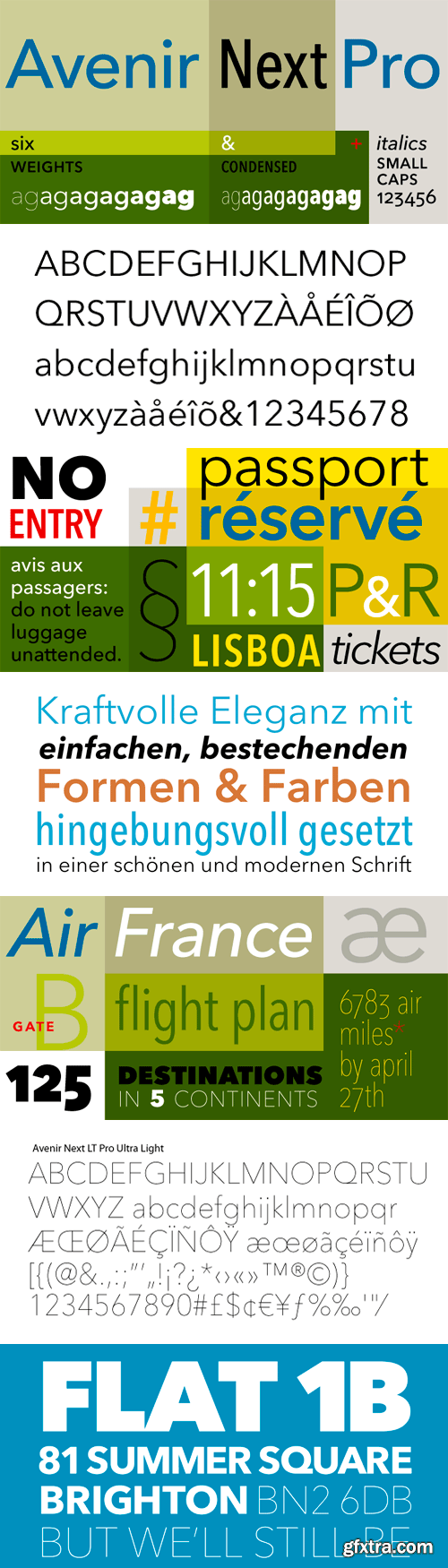
In 2004, Frutiger, together with Linotype in-house type designer Akira Kobayashi, reworked the Avenir family to address on-screen display issues. The result was titled Avenir Next. The typeface family was increased to 24 fonts: 6 weights, each with a roman and italic version, in 2 widths: normal and condensed. Frutiger’s numbering system was abandoned in favor of more conventional weight names. The glyph set was expanded to include small caps, old style figures, subscripts and superscripts, ligatures.
OTF | 17 Fonts | JPEG Preview | 4 Mb RAR


https://www.myfonts.com/fonts/linotype/avenir-next-pro/
Avenir Next Pro is a new take on a classic face—it’s the result of a project whose goal was to take a beautifully designed sans and update it so that its technical standards surpass the status quo, leaving us with a truly superior sans family. This family is not only an update though, in fact it is the expansion of the original concept that takes the Avenir Next design to the next level. In addition to the standard styles ranging from ultra light to heavy, this 32-font collection offers condensed faces that rival any other sans on the market in on and off—screen readability at any size alongside heavy weights that would make excellent display faces in their own right and have the ability to pair well with so many contemporary serif body types. Overall, the family’s design is clean, straightforward and works brilliantly for blocks of copy and headlines alike. Akira Kobayashi worked alongside Avenir’s esteemed creator Adrian Frutiger to bring Avenir Next Pro to life. It was Akira’s ability to bring his own finesse and ideas for expansion into the project while remaining true to Frutiger’s original intent, that makes this not just a modern typeface, but one ahead of its time.


https://www.myfonts.com/collections/font-thography-font-alcode
Thography font is a new decorative typeface. This font has a very beautiful and elegant opentype feature, so that it can make users happy and can increase creativity or productivity, you can use this font very easily.
https://www.skillshare.com/classes/Font-Crash-Course-Learning-the-Basics-of-Font-and-Typography/2071052143
The ultimate starter course for someone wanting to dive into the world of fonts! You do not have to have Adobe Photoshop or illustrator to get something out of the class, but I would suggest at least a trial version so you can go along with me.
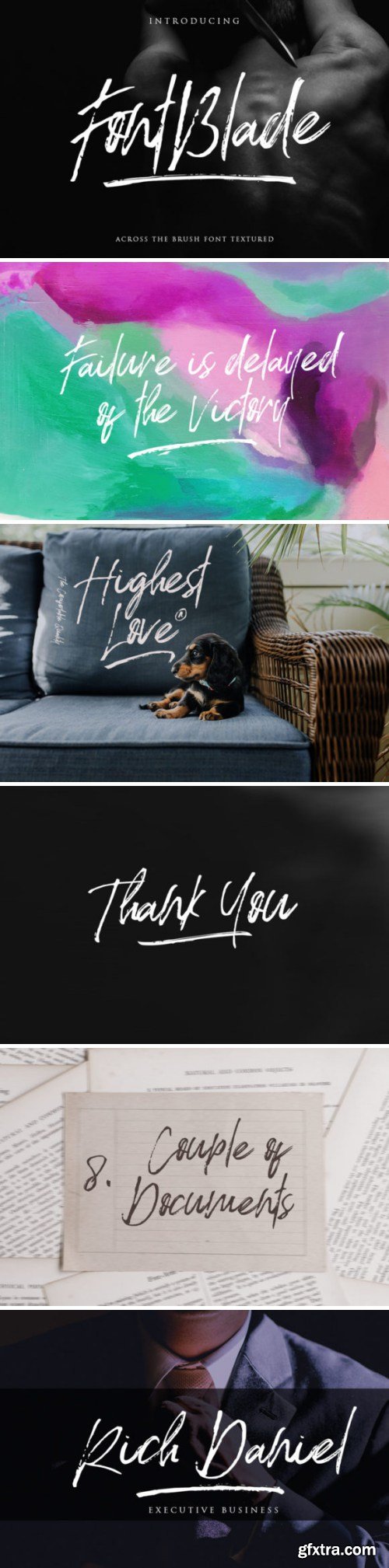
Font Blade Font
SermonBox - Seasonal Collection

SermonBox - The Series Pack Collection

Top Rated News


Would you like to be a Author?


